


Problem
Background

Goal & Outcome
Design Outcome
—
Introduced a Feature Breakdown experience to improve product understanding.
—
Expanded contextual purchase entry points across the platform.
—
Made complex site purchasing states visible before checkout.
—

See how the experience came together below ↓
Approach

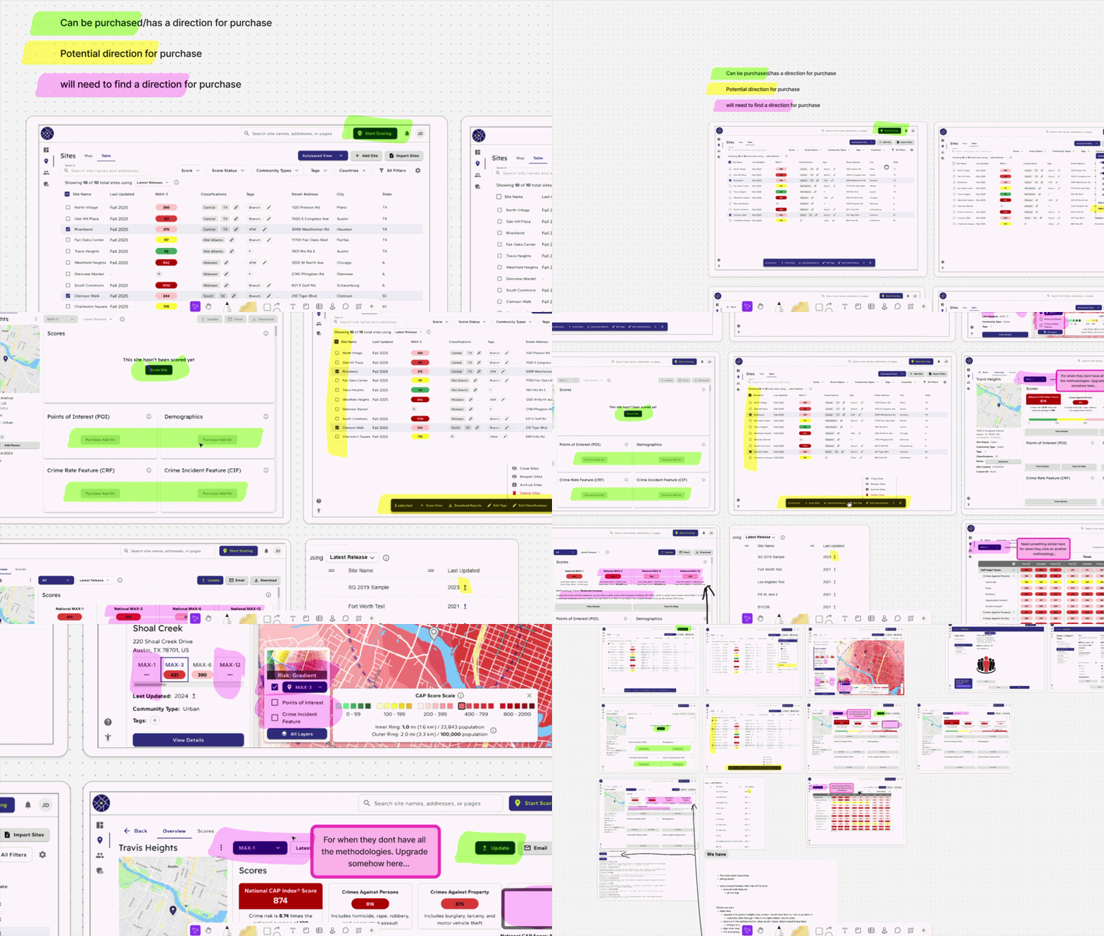
Three Principles
01
Clarify Product Relationships
Make products, plans, features, and purchasing implications easier to understand and compare.
02
Improve Discoverability
03
Design for Scalability
Create a structure that can accommodate new products and scenarios without requiring a complete redesign.
Key Design Decisions
Goal 1
Helping customers understand what they're purchasing
Decision 01 · Clarifying Products & Plans
Challenge
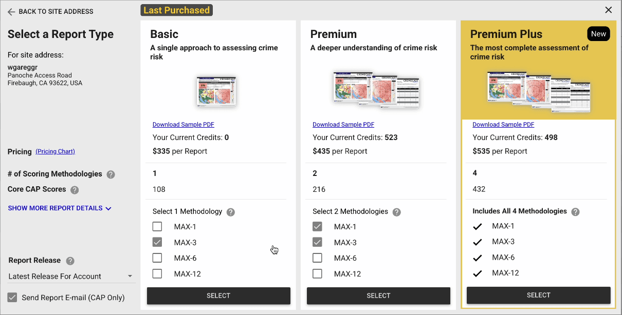
Plan comparisons relied on quantities and short descriptions, making it difficult to understand what each plan actually included.
Solution
I reorganized the plan hierarchy and redesigned the cards to surface specific features per plan, making differences easier to scan and compare.
Before
After

Decision 02 · Feature Breakdown
Challenge
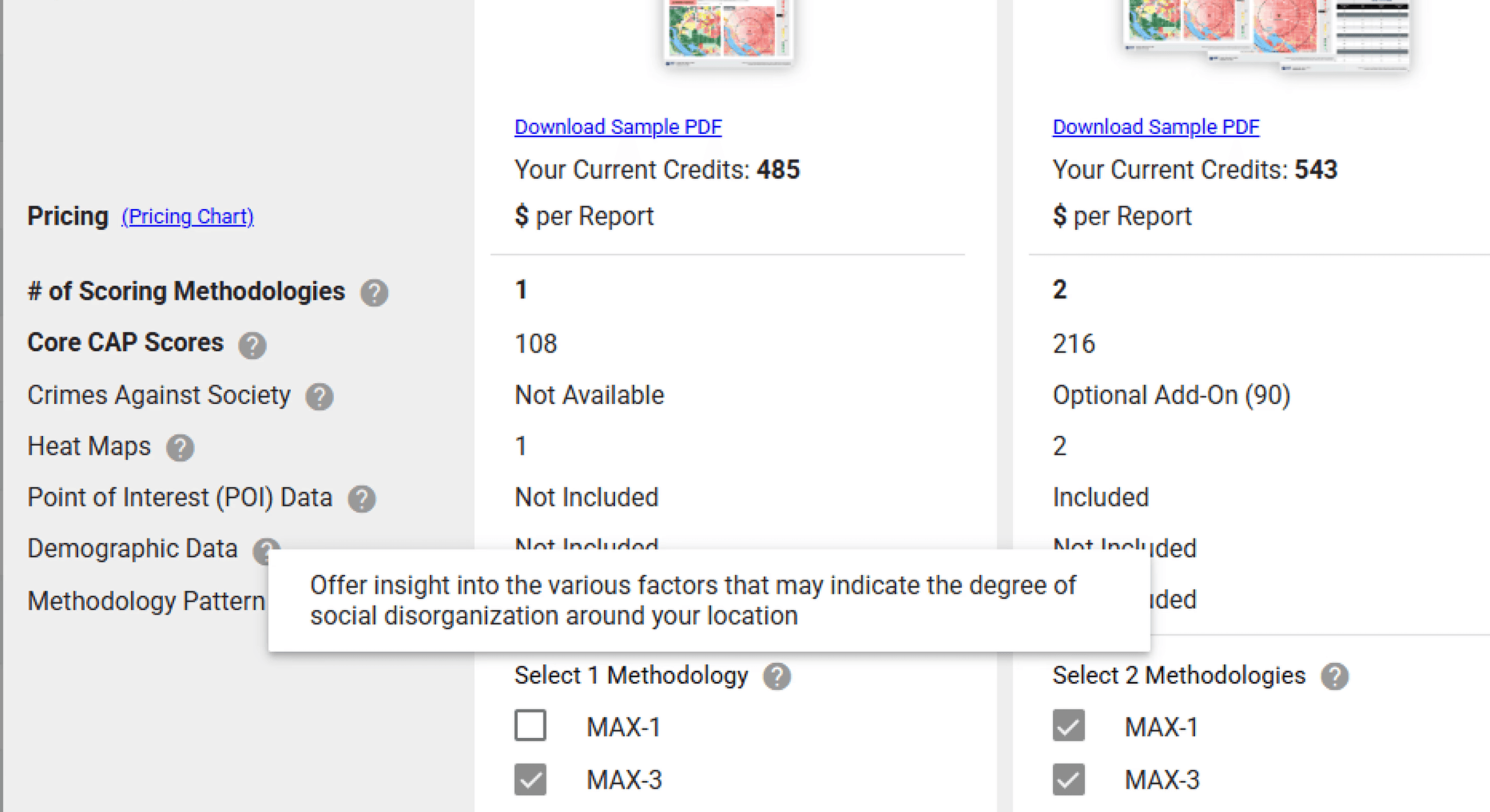
Feature names and short tooltips weren't enough for unfamiliar customers to understand what they were paying for.
Solution
I introduced a Feature Breakdown that explains each feature with richer descriptions and supporting imagery, letting customers explore value without leaving the purchase flow.

Before
After

Decision 03 · Designing for Global Purchases
Challenge
Customers purchasing sites across multiple countries previously needed separate orders. CAPData 3.0 introduced multi-country purchasing, but one plan tier still needed to apply across all selected sites.
Solution
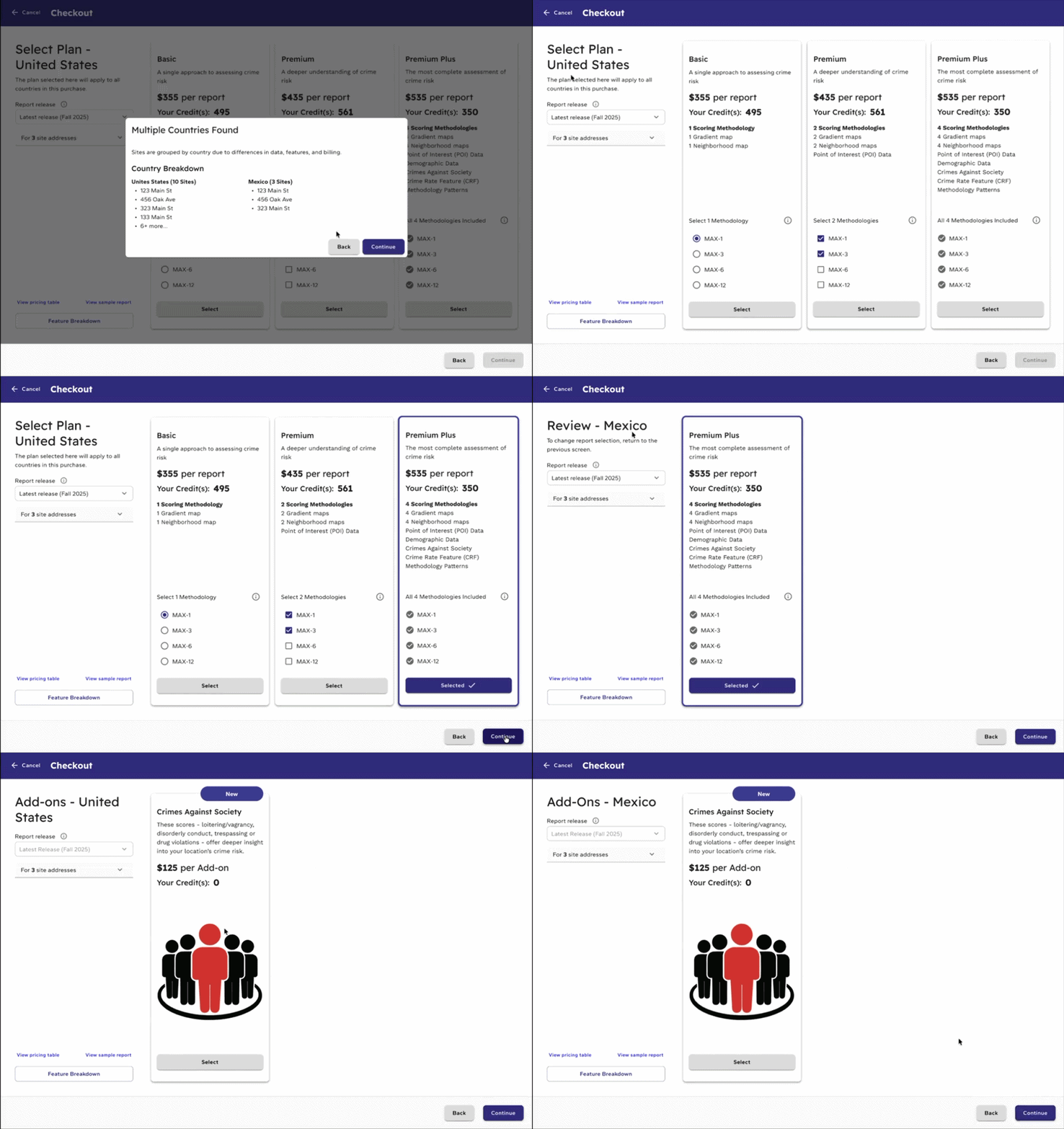
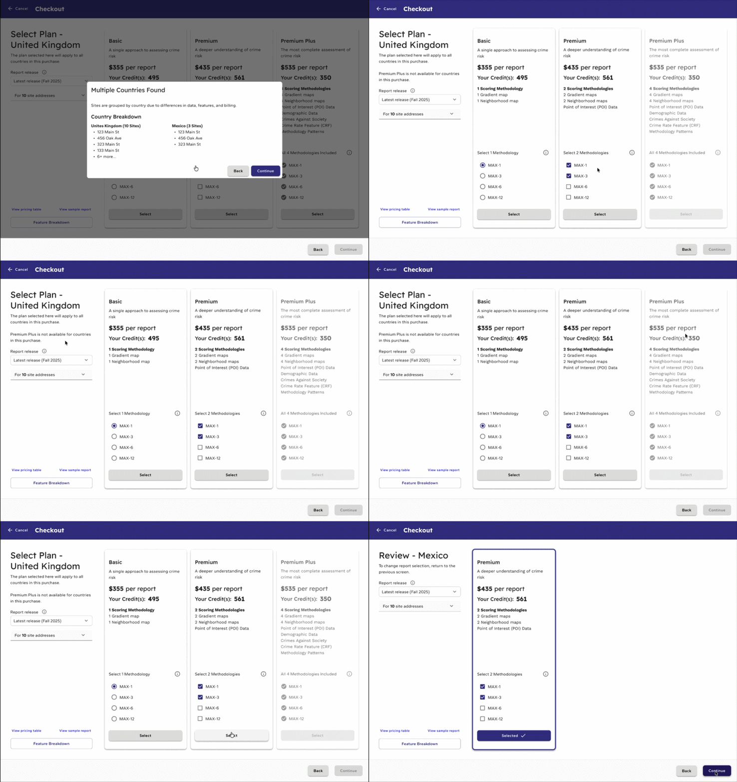
I designed a guided multi-country flow that groups sites by country and clearly shows how the selected plan, pricing, and features translate across regions—keeping the purchase in one cohesive order.


Exploring the Workflow
Because multi-country purchasing was a new capability, I explored a few workflow iterations with the team and developers—making country-specific differences and system constraints understandable without adding unnecessary complexity.


The final UI allowed customers to purchase sites across multiple countries within one order. After selecting a plan for the first country, subsequent country steps showed only that plan, which clearly showed the country-specific pricing, features, and methodologies they would receive. This preserved the information customers needed to make an informed purchase without presenting choices they could no longer change.
Design principle: Preserve transparency without presenting false choices.
Product Thinking
Rather than expecting customers to rely on sales for clarification, I designed education directly into the purchase flow—approachable for first-time customers while preserving speed for experienced users.
Goal 2
Decision 01 · Clarifying Site Status
Challenge
Solution
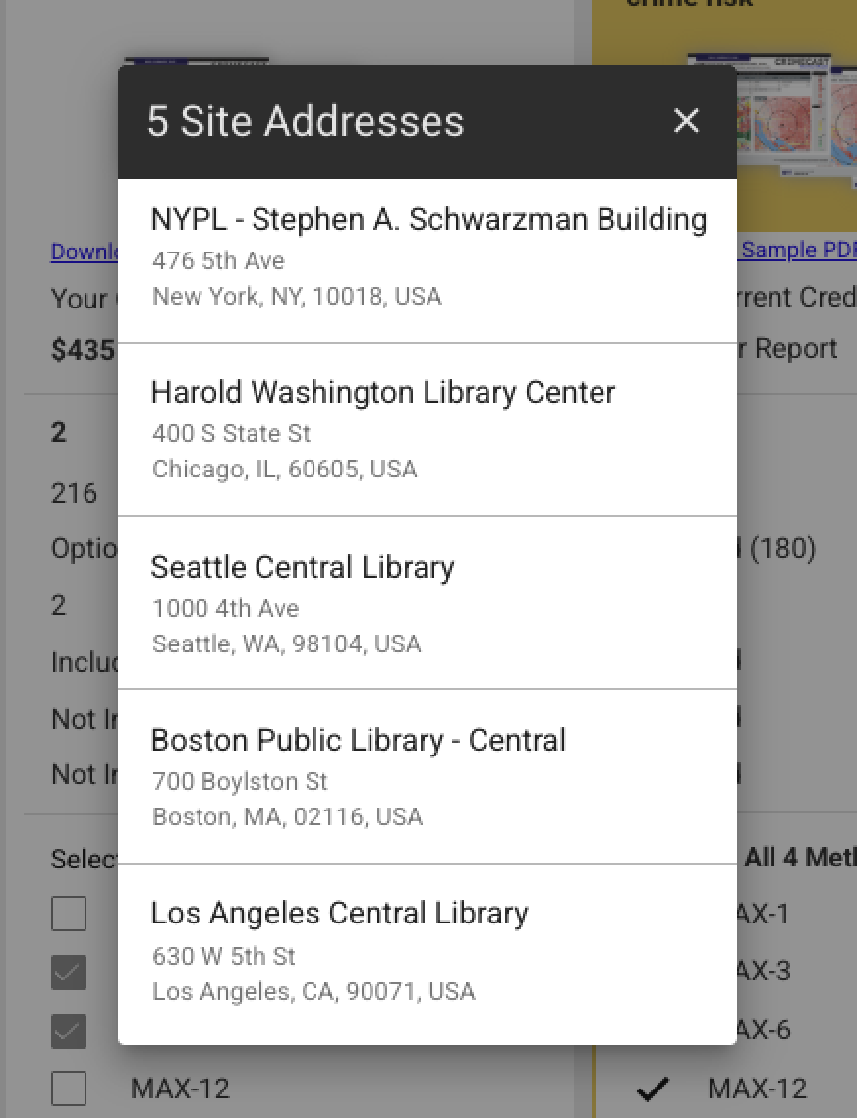
I redesigned the site list to make each site's status explicit within the workflow, helping customers understand what would happen to every location before moving forward.
Before
After

Decision 02 · Improving Purchase Transparency
Challenge
The existing import summary made it difficult to tell which sites would incur charges, remain unchanged, or couldn't be modified because of their current plan.
Solution
I redesigned the Import Summary to group sites by status and surface billing and plan constraints before purchase—giving customers a clearer review of what would happen next.
Before

After

Decision 03 · Expanding Purchase Entry Points
Challenge
Limited purchase entry points meant customers—especially newer ones—could overlook relevant products while moving through CAPData.
Solution
I introduced contextual purchase entry points across the platform. When CrimeStrata (a new product) was added mid-project, it integrated into the new structure without requiring a major workflow redesign.
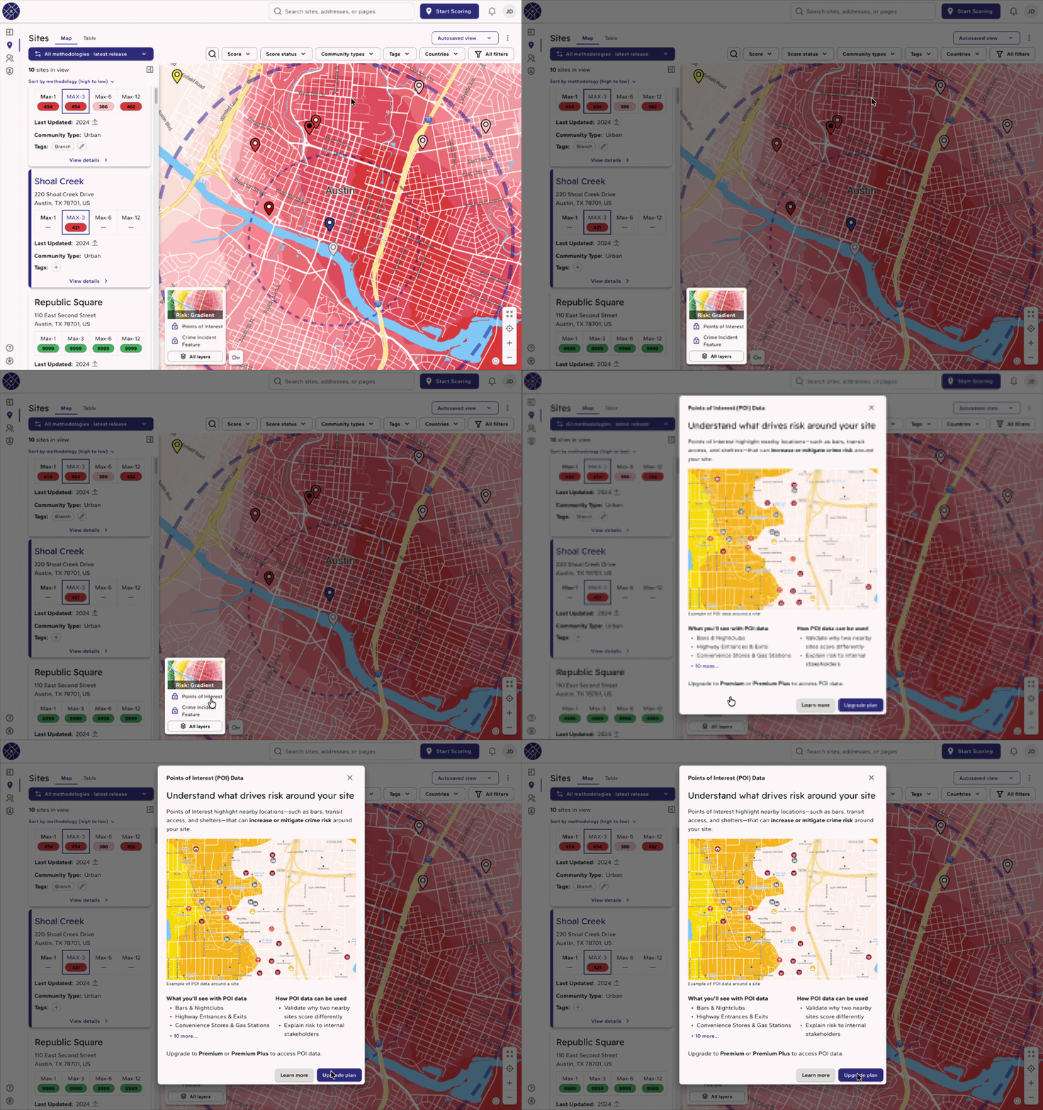
The system mapping from earlier in my process helped uncover these opportunities, revealing where new purchase entry points could naturally fit into existing customer workflows. ↑ Revisit the system mapping
Scalability in Practice

Responsive Design
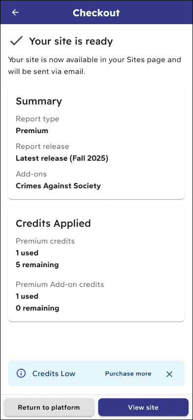
The purchase experience also needed to remain clear and usable across smaller screens. I translated the redesigned workflows to responsive layouts while preserving the same information hierarchy, purchasing logic, and decision-making context across desktop and mobile.
Rather than simply shrinking the desktop experience, layouts and interactions were adapted to prioritize the information users needed at each step while maintaining consistency across devices.


Plan Selection

Billing Details

item summary

Purchase Confirmation
Collaboration & Delivery
Many improvements changed more than the interface, they introduced new workflows and required backend support. I worked closely with product managers and developers to validate feasibility, resolve edge cases, and advocate for UX improvements when they required additional development effort.

Tradeoff
Interactive Prototyping

QA & Refinement


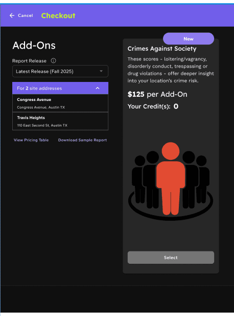

Design vs. implementation QA — interaction behavior, workflow logic, responsive states, component consistency
Outcome
Multi-country purchasing
Unified previously separate country purchases into one cohesive workflow, which was a capability enterprise customers had long needed that the product couldn't yet support.
4+ contextual entry points
Expanded opportunities for customers to discover and purchase relevant products across CAPData, from search results, feature pages, account management, and in-context upgrade prompts.
Built to scale
Accommodated a new product introduced mid-project without requiring a major restructuring of the purchase flow. The architecture was flexible enough to absorb the change.
End-to-end delivery
Designed, prototyped, QA'd, and largely implemented for CAPData 3.0, with design involved through engineering handoff and QA resolution.
Project Scope
Desktop + Mobile
Responsive experience
10+ Core Screens
Across the purchase journey
20+ States & Scenarios
Supporting complex purchasing conditions
6-7 Months
End-to-end project
Designed through implementation
What I Would Measure After Launch
Intended future success measures—not claimed outcomes.
01
Purchase completion rate
02
Contextual entry point usage
04
Purchasing-related support volume
Reflection