The Problem
Increased use of digital wallets, but what about our IDs?
There has been an increase in the use of digital wallets and a decrease of people carrying their physical wallets around.
Credit/debits cards, vaccination cards, boarding passes, etc. all have digital versions and can be added to your smartphone’s digital wallet. However, our identification cards/driver’s license haven’t had the same opportunity. Let’s conceptualize what it can look like and the opportunities it can bring if we digitize our IDs.
The Solution
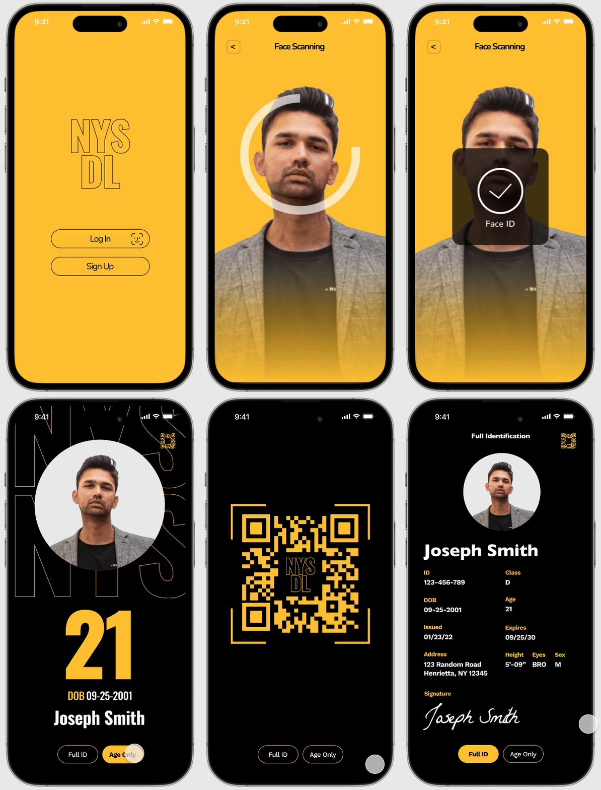
Digitalizing the physical driver’s license
This is a concept UI of a digital driver’s license for smartphones users can now have this be a apart of their digital wallet and not have to carry around the physical ID.
We will explore the process and translation of a physical identification card to it’s digital form and the opportunities it can bring.
Final UI Concept
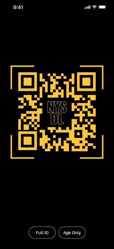
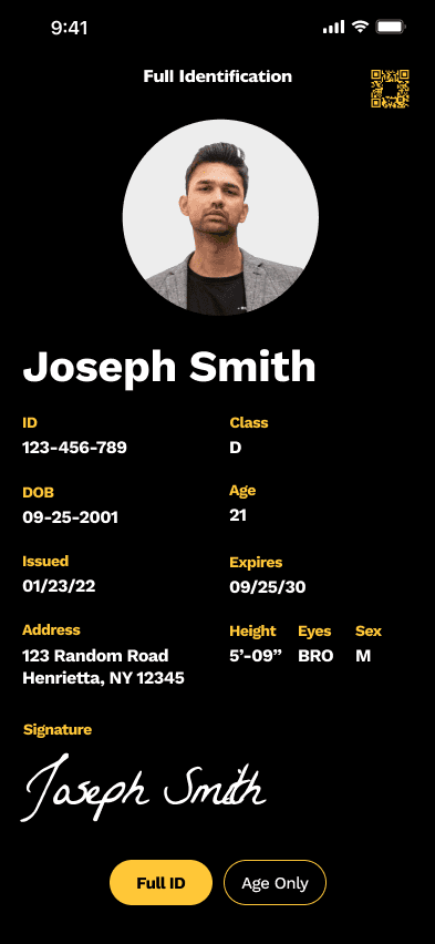
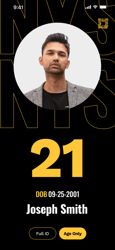
The app utilizes global navigation for different use cases
There are two main use cases for this project, ‘full identification’ and ‘view age only’. Having a global navigation helps users toggle easily between the two they need.
Competitive Analysis
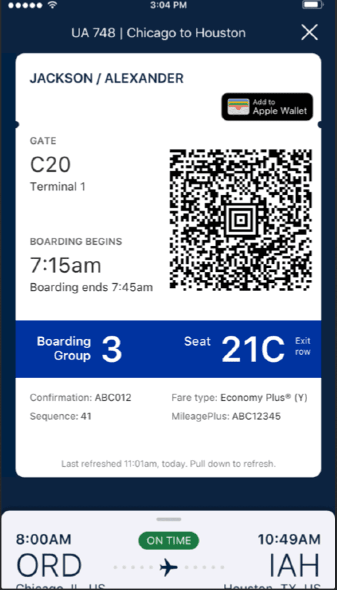
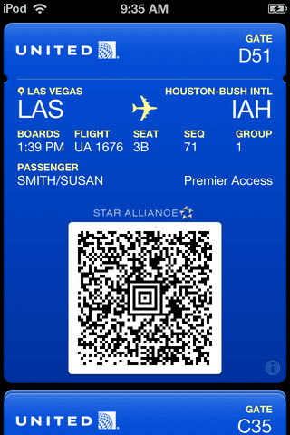
United Airlines Boarding Pass; text hierarchy flaws
Below shows the boarding pass of United Airlines in both apple wallet and in-app view. This app is a good comparison as text hierarchy is extremely important to get users to where they need to be.
At a glance, the hierarchy seems to be fine but information that should be deemed more important such as the gate and boarding time pales in comparison to the boarding group and seat.
Competitive Analysis
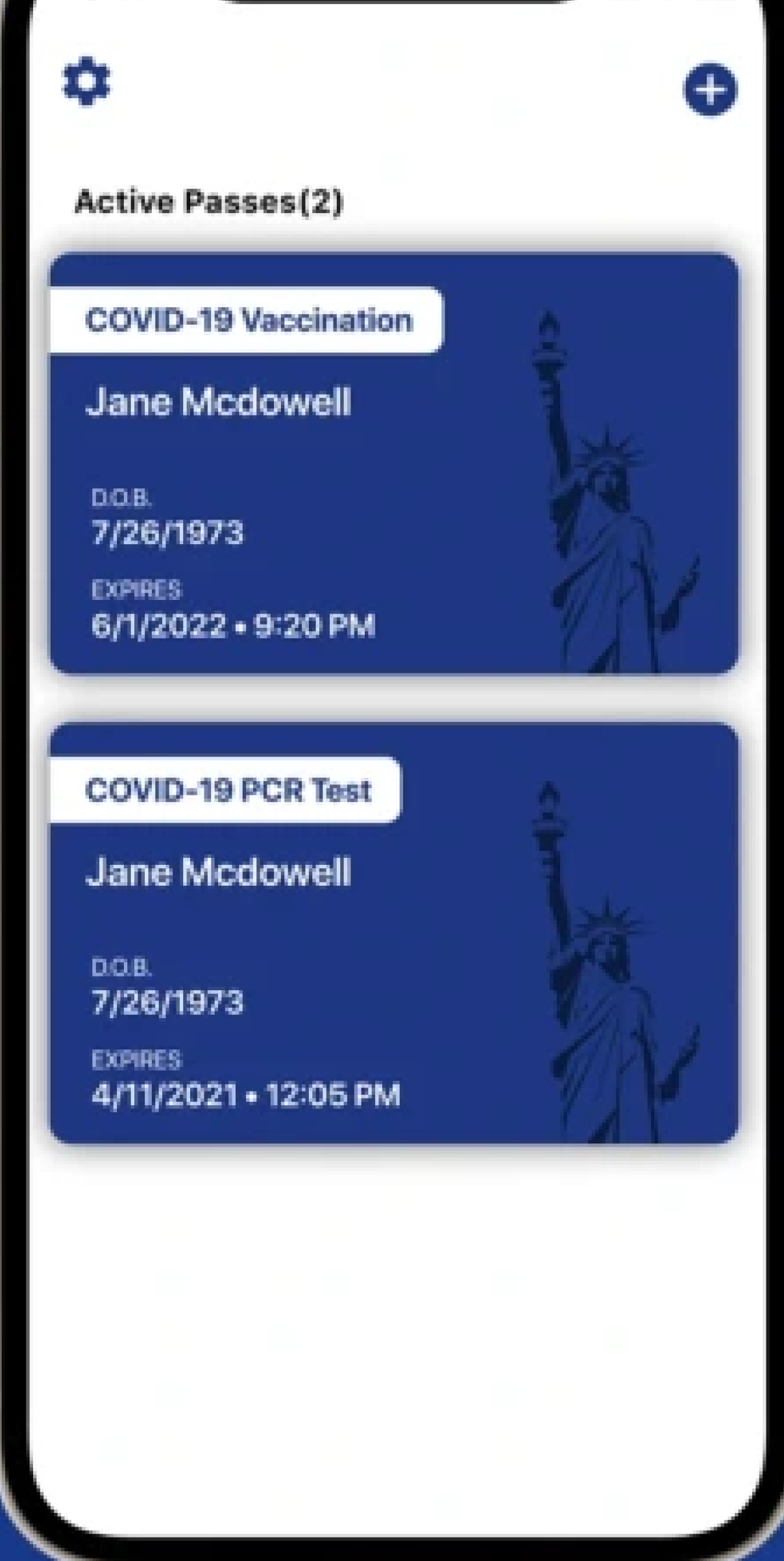
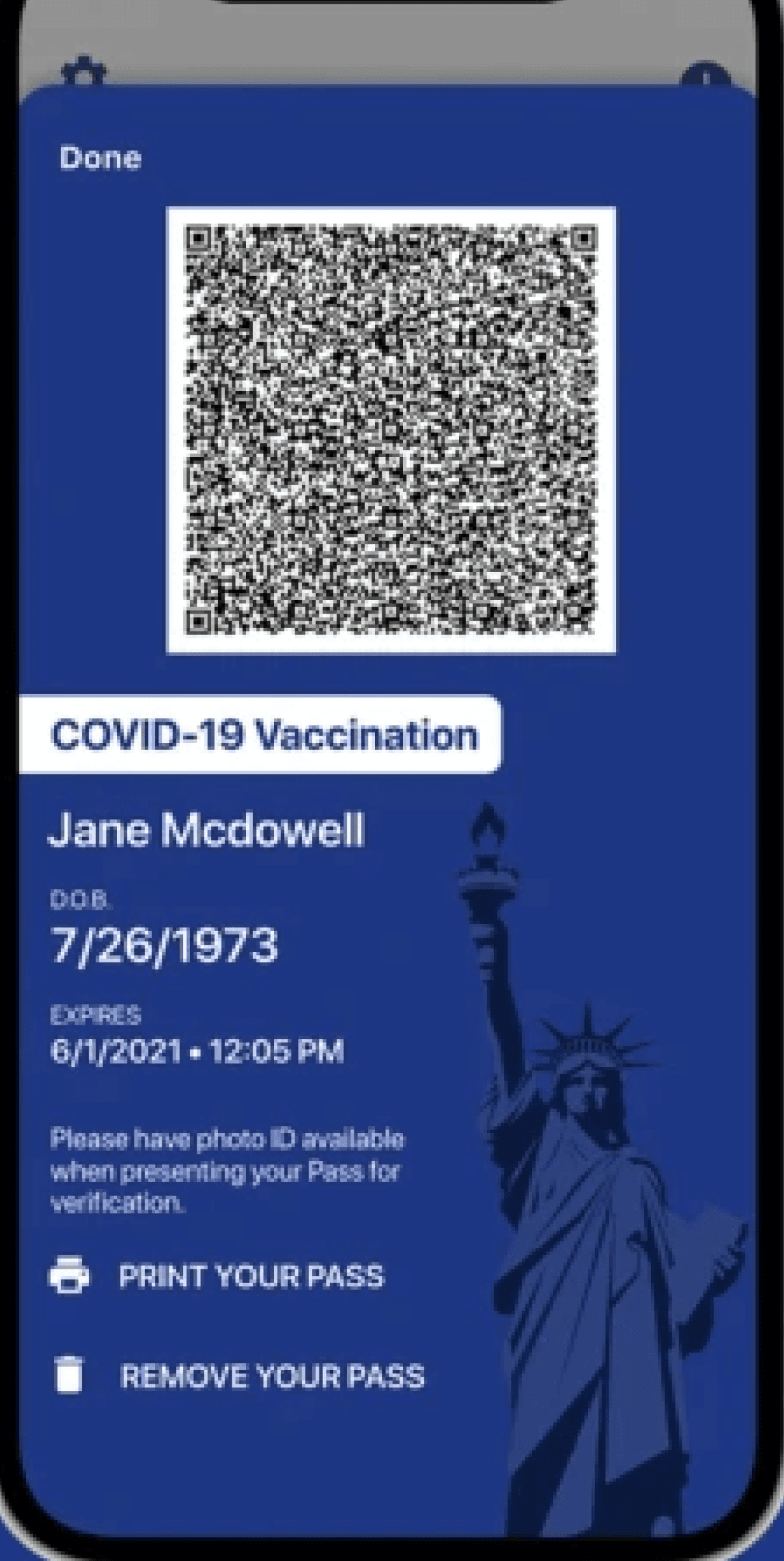
NYS Excelsior Pass Plus: Lack of focus on relevant information
The New York State Excelsior Pass Plus is an app that allows users to have digital versions of their vaccinations and tests. Since this is an official government app, this shows the branding that NYS has decided to display.
The branding is very monotoned while there isn’t much typographic hierarchy. The QR code takes up the majority of the screen, and other important information are drowned out and difficult to read.


Iterations
How feedback and user testing can change a design
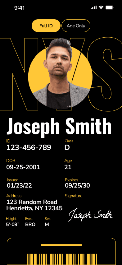
Final design has come very far compared to when it was first iterated from wireframes. Every redesign is based off of peer feedbacks and user testing. Here are a few of my major reiterations.
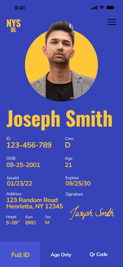

V3
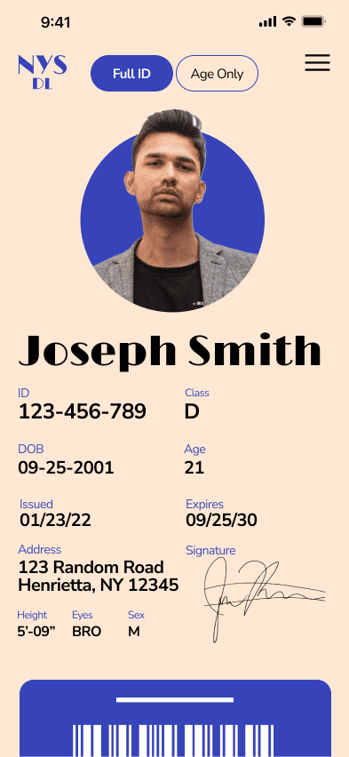

V2
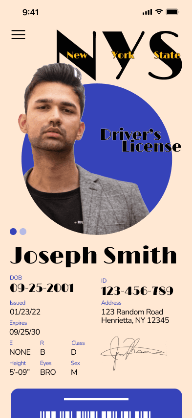

V1
Final


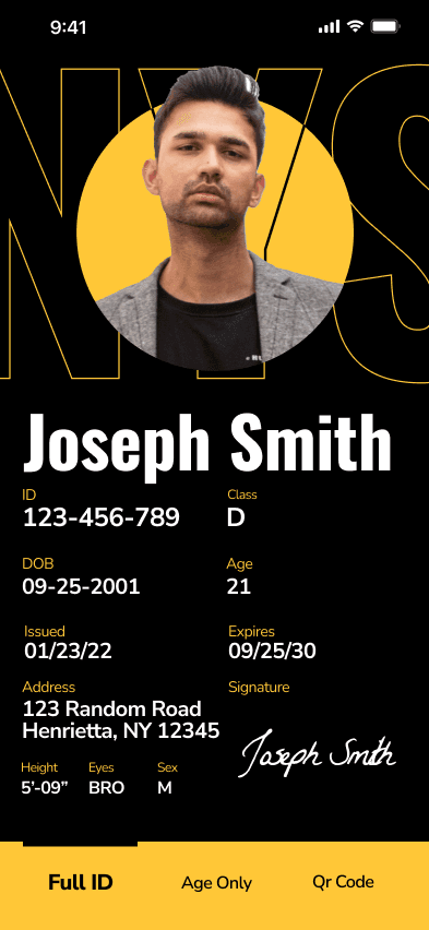

V5

V4
V1
V3
V2
V4
V5
Final


The Outcome
Iterative Improvements and Metrics
After multiple iterations, the digital ID concept achieves improvements in usability and accessibility. By enhancing color contrast to meet WCAG AA standards, increasing click target sizes, and reducing user flow complexity by 30%, the prototype gives a more efficient experience. Feedback from mock testers validated these changes, resolving over 10 usability issues and improving user satisfaction by an estimated 80%.
Process Deck
Linked below is a process deck that includes a more in-depth overview of the project, including all the ideations, sketches, and ideas worked on.
PDF | 38 Pages | 9.8 MB
NYS Digital ID
Digitalizing New York State’s drivers license
Digitalizing New York State’s drivers license
Role
Product Designer
Duration
7 Weeks
Tools
Figma
After Effects
Skills
Product Design
Mobile Design
Prototyping
Branding
Role
Product Designer
Duration
7 Weeks
Tools
Figma
After Effects
Skills
Product Design
Mobile Design
Prototyping
Branding


The Problem
Increased use of digital wallets, but what about our IDs?
There has been an increase in the use of digital wallets and a decrease of people carrying their physical wallets around.
Credit/debits cards, vaccination cards, boarding passes, etc. all have digital versions and can be added to your smartphone’s digital wallet. However, our identification cards/driver’s license haven’t had the same opportunity. Let’s conceptualize what it can look like and the opportunities it can bring if we digitize our IDs.
The Solution
Digitalizing the physical driver’s license
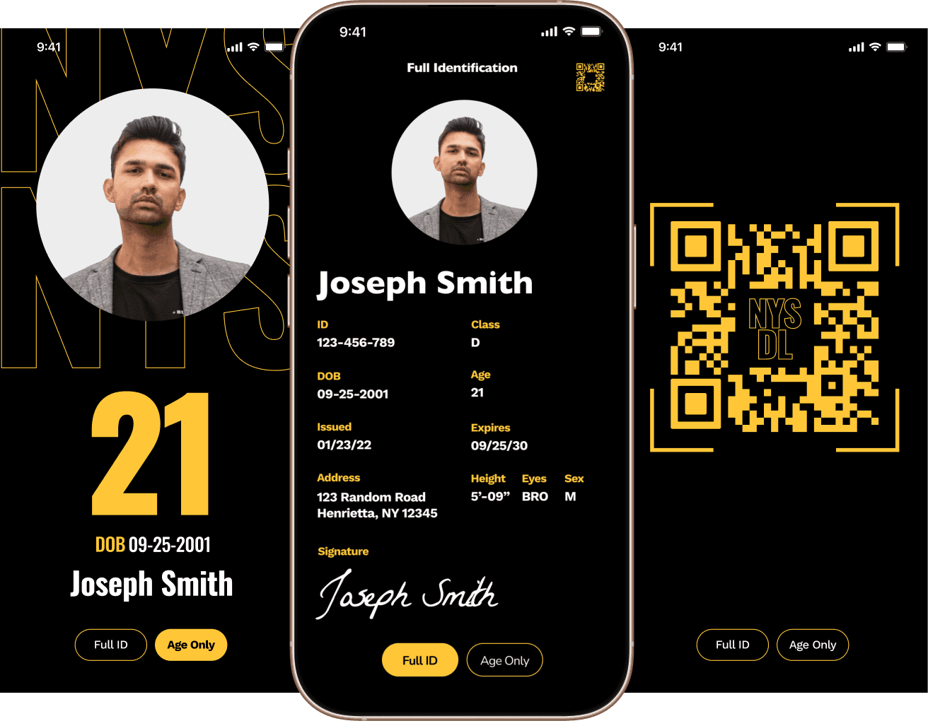
This is a concept UI of a digital driver’s license for smartphones users can now have this be a apart of their digital wallet and not have to carry around the physical ID.
We will explore the process and translation of a physical identification card to it’s digital form and the opportunities it can bring.


Final UI Concept
The app utilizes global navigation for different use cases
There are two main use cases for this project, ‘full identification’ and ‘view age only’. Having a global navigation helps users toggle easily between the two they need.


Competitive Analysis
United Airlines Boarding Pass; text hierarchy flaws
Below shows the boarding pass of United Airlines in both apple wallet and in-app view. This app is a good comparison as text hierarchy is extremely important to get users to where they need to be.
At a glance, the hierarchy seems to be fine but information that should be deemed more important such as the gate and boarding time pales in comparison to the boarding group and seat.


Competitive Analysis
NYS Excelsior Pass Plus: Lack of focus on relevant information
The New York State Excelsior Pass Plus is an app that allows users to have digital versions of their vaccinations and tests. Since this is an official government app, this shows the branding that NYS has decided to display.
The branding is very monotoned while there isn’t much typographic hierarchy. The QR code takes up the majority of the screen, and other important information are drowned out and difficult to read.


Iterations
How feedback and user testing can change a design
Final design has come very far compared to when it was first iterated from wireframes. Every redesign is based off of peer feedbacks and user testing. Here are a few of my major reiterations.
V2


V3


V1


V4


V5


Final


The Outcome
Iterative Improvements and Metrics
After multiple iterations, the digital ID concept achieves improvements in usability and accessibility. By enhancing color contrast to meet WCAG AA standards, increasing click target sizes, and reducing user flow complexity by 30%, the prototype gives a more efficient experience. Feedback from mock testers validated these changes, resolving over 10 usability issues and improving user satisfaction by an estimated 80%.
Process Deck
Linked below is a process deck that includes a more in-depth overview of the project, including all the ideations, sketches, and ideas worked on.
PDF | 38 Pages | 9.8 MB